Basic statistics for M.L and D.S VOL1:
In this Blog, i am going to talk about the statistical concepts used in Machine Learning. Data science and Machine learning is the hottest career path in the 21st century, but also it's a central skill. But become a data scientist neither easy nor difficult task. You must have a keen knowledge of mathematics, have a hands-on experience on programming(mostly in R and Python), must have known theoretical concepts used for M.L(Machine Learning). Here, i am going to familiarize you with some statistical concepts used to become an M.L engineer or Data Scientist. This is the first part of the whole blog. It would contain more than 2 articles in order to cover the concepts of mathematics used in D.S(Data Science) and M.L. These will also include some probability distribution concepts. So without wasting any time, let's move on.

Exploring Data:
Cases and variables and levels of measurement:
Imagine you are very much interested in the game of Cricket. You are the person, who wish to know how much a team score in a match, how many wickets taken by a particular player, how many runs were scored by a player in a match, etc. Well, if you aren't that much interested in Cricket then you will surely gain some knowledge of it along with statistics.
The number of runs scored, the number of games won, the number of wickets taken, these things can be thought in terms of variables and cases. Variables are characteristics of something or someone and cases are something or someone. Lemme be more specific likewise, Suppose the player is Virat Kohli. You'd wish to know runs scored by him, catches taken by him, his height, his body weight, his age. These characteristics are nothing but the variables, and Virat is itself a case.
Now suppose we are talking about not a single player, but a whole team India means there is no Variation here. Not a single player comes from another team, so here characteristics are not variable but constant.
Now let's discuss different levels of measurement. First, we will discuss the Categorical Variables. There are two types of categorical variables. One is Nominal and other is Ordinal. A Nominal ar variable is made up of categories that differ from each other. This means that we can't tell which is better or worse. For instance, suppose there is a cricket team named India and football team Barcelona, we cannot tell which is best or worse. Another is the Ordinal Variable. An Ordinal Variable doesn't only differ between categories but also tells the order. For instance, Suppose you have found a list of ICC Cricket World Cup rankings and got to know the order, i.e India comes first, New Zealand comes second, and so on... Let's discuss Quantitative variables
Now, the next level of measurement is the Interval level. As the name suggests, we have different categories ordered and have an interval. For instance, suppose you wish to know the age of each player of a particular team, as the difference between a 16-year-old and 18 years old is the same as 14 and 16 years old player. The final level of measurement is Ratio level. It is similar to the interval level, with a meaningful zero point. An example is a player's height. There is a difference between categories, there is order, there is an interval and meaningful zero point. As the height of zero centimeters is no height at all(**not for age).


Data Matrix and Frequency table:
Basically, Data Matrix is used to order all the information of a player or say variables of a case in the data table. For instance, consider this image:

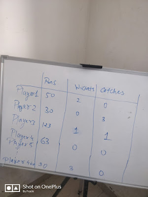

Here you can see, the cases(player1-5) are displayed in the columns and the variables(Runs, Wickets, Catches) are displayed in the columns. The values which are displayed are nothing but observations. For instance, player 4 has scored 63 runs, took zero wickets and catches. This whole table is a Data Matrix. But what if we wish to make a table for 400 players. Then it wouldn't be a complete Data Matrix, it would be just part of it. For instance,
Here you can see, these dots are just left out from the matrix. Then we can use or summarize the data. Suppose you wish to know the distribution according to the player's Hair color. For instance:


Here we have formed the Frequency Table. We have distinguished it into 4 categories, Black, Blond, Brown, Other. We got to know that 76 players have black hair out of 200. Note these values up to 200 so no missing data. We can also calculate relative frequencies by using percentages. Likewise, 20% of all players having Brown hair. And similarly, we also can calculate cumulative frequency, it is nothing but frequencies are added up.
But what if we wish to order players according to their height. We can't do that in this way, as height is continuous values like 180.3 cm, 166.8. So here we use an interval level of measurement. For instance:


Here I've set the range of values like there are 76 players who have a height in the range of 160-165 cm.
Graphs and shapes of distributions:
Here i am going to show you how you can visualize the data using various types of plots using frequency tables. Imagine countries participated in the Cricket league, there are 5 countries those who are participated and you wish to visualize them. In that case, you can use the Pie Chart. For instance, Here's the code in order to plot a Pie chart:
import matplotlib.pyplot as plt
labels='India','South Africa','Austrailia','New Zealand','Bangladesh'
sizes=[30,20,15,15,20]
color=['light blue','green','yellow','black','light green']
plt.pie(sizes,labels=labels,colors=colors,autopct='%.2f',shadow=True)
plt.axis('equal')
plt.show()
Here's the result:


Here you can see, 30% of Indian players have participated in the league, 15% from New Zealand and so on and you can see almost one-third of players are from India.
Another way to show is a bar graph. For instance, Here's the code in order to plot the Bar graph:
import numpy as np
import matplotlib.pyplot as plt
objects=('India','South Africa','Austrailia','New Zealand','Bangladesh')
y_pos=np.arange(len(objects))
performance=[30,20,15,15,20]
colors=['Blue','dark green','yellow','black','green']
plt.bar(performance,y_pos,align='center',alpha=0.5,color=colors)
plt.xticks(y_pos,performance)
plt.show()
Here's the result:


Both kinds of charts have some advantages and disadvantages. As you can see immediately the percentage of players on a pie chart. On the other hand, the exact number of players can't retrieve from a pie chart and can easily get from a bar graph.
But what if you have many cases. For instance, suppose there are more than 100 countries participating in a league then it would be hard to visualize using a pie chart. Then instead of a pie chart, we can use Bar graphs over the pie chart.
Up till now, we've talked about nominal variables. In order to deal with quantitative variables, we will use a Histogram. A histogram is almost similar to a bar graph, but only one difference. Like the bars in Histogram touch each other. This touching represents a value of an interval underlying on a continuous scale. Suppose we are interested in the body weight of each player. If we have different weight i.e 74.9 or 83.5 kg, but we can't plot a separate bar for every single weight, instead we took intervals. For instance, here's the code to plot histogram:
import numpy as np
import matplotlib.pyplot as plt
players=[1,2,3,4,5]
weights=[60,70,76,89,50]
plt.hist([players,weights])
plt.show()
Here's the result:


Measures of Central Tendency:
Next step is to summarize the data which is done by using measures of central tendency. There are basically three ways by which we can do that.
First, we will talk about Mode. Finding the mode is comparatively easy as compared to calculate other measures of central tendency. It is basically the value which is occurred most frequently. This measure of central tendency basically done for a nominal level or ordinal level. Consider our Pie chart. As you can see, Indian players occurred most in a league(30% of all). Suppose in a survey, most of the people voted Mahendra Singh Dhoni is the best cricketer out of 10 other cricketers. Then here the mode will be Mahendra Singh Dhoni.
Here's the code:
import statistics
x=[3,3,5,77,5,3,3,1,2,6]
statistics.mode(x)
Result:
3
The second measure of central Meantendency is the Median. This measure of central tendency is nothing but the middle value of the observations when they are ordered from smallest to largest. But what if we have even number of observations. Then Median will be calculated by taking an average of two middle values.
Here's the code to compute median:
import statistics
x=[3,3,5,77,5,3,3,1,2,6]
statistics.median(x)
The last measure of central tendency is Mean. Mean is nothing but the average of all the observations. It is calculated by the sum of all observations divided by a number of observations. Here's the code:
import statistics
x=[3,3,5,77,5,3,3,1,2,6]
statistics.mean(x)
Now you are quite familiar with three M's of central tendency. Now suppose you are interested to know the average salary of some cricketers.
here's the list that cricketers:


Here, if we calculate the mean of the above observations we will get 25.6 L.P.A, but here we can see only one player earn more 25 L.P.A. Here, mean increase slightly upto 4.2 L.P.A. Here we can see Virat Kohli is an Outlier. He earns more than the people/cricketers present. So here it makes sense that we should calculate the median instead of mean in order to measure of central tendency.
Range, Inter-Quartile Range, and Box Plot:
Suppose we need to know at what extent of portions of a player's body is covered with tattoo. For instance:


As you can see, these two teams differ from each other. However, their three M's are the same. Here we need to have information related to the variability of data. We will discuss two methods of the variability of data. One is Range and another one is the Inter-Quartile Range(IQR). A range is the most simple measure of variability. It is just the difference in the highest and lowest value. As you can see, the Range of team one is 30.6-0=30.6%. and the Range of team two is 30.3-10.7=19.6%.
But the inter-quartile range is a better measure of variability. In this method, it will ignore or exclude the outliers.
IQR basically divides your distribution into 4 equal parts. So, if your distribution looks like this, you divide the scores in such a way that the 25 percent of your lowest scores are below this score and the 25 percent of your highest scores are above this value. We also have 25 percent of our scores here, and 25 percent of our scores here. The values that now divide the distribution are called quartiles. This is the first quartile (Q1), this is the second quartile (Q2) and this is the third quartile (Q3).
Outliers are Q1-1.5IQR and Q3+1.5IQR
Now let's see how the box plot would look like:

Here's the code:
For IQR:
import numpy as np
import numpy as np
x=np.array([4.1, 6.2, 6.7, 7.1, 7.4, 7.4, 7.9, 8.1])
Q1=np.percentile(x,25,interpolation='midpoint')
Q3=np.percentile(x,75,interpolation='midpoint')
IQR=Q3-Q1
print(IQR)
For BoxPlot:
import matplotlib.pyplot as plt
x1 = [4.65,6.45,7.25,7.65,9.45]
fig = plt.figure(figsize=(8,6))
plt.boxplot(x1, 0, 'rs', 1)
plt.xlabel('measurement x')
t = plt.title('Box plot')
plt.show()
Here's the result:

So that's all for the first part of statistics for machine learning, in the next part we will discuss some more concepts which i guess some of you have never heard about. This is just a start.
So until then keep practicing
Here's the link of the second article:
statistics for M.L and D.S part-2
Here's the link of the second article:
statistics for M.L and D.S part-2
Happy coding!
Comments
Post a Comment